UWM Illustrations
|
|
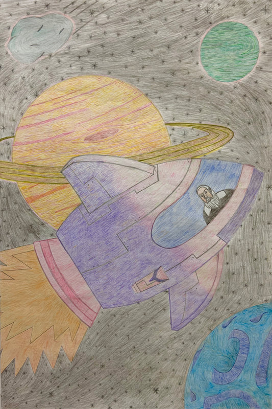
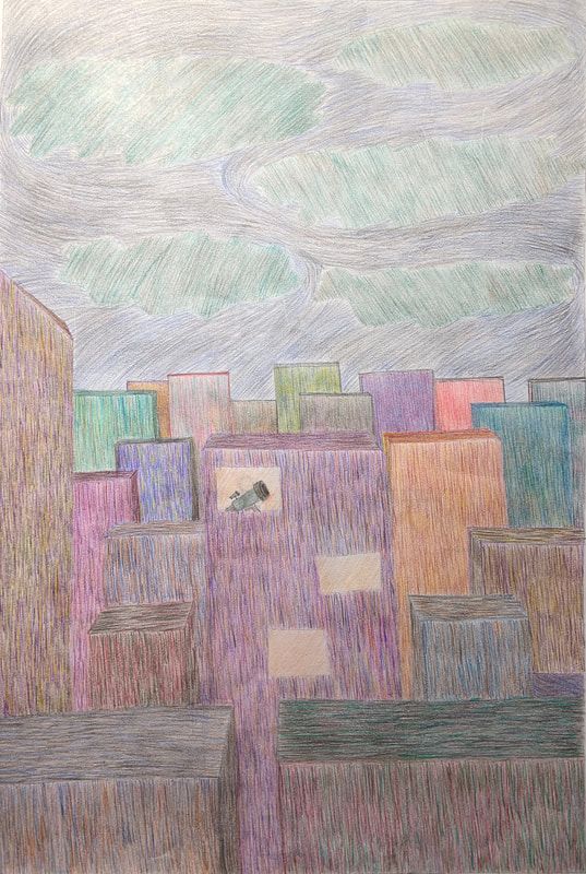
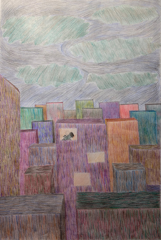
Space vs Earth
2 43 x 29 cm papers
Colored Pencil on paper
November-December, 2019
Colored Pencil on paper
November-December, 2019
Exhibition Text
"Space vs. Earth" is a pair of colored pencil on paper illustrations. The purpose of the illustrations was to showcase opposites. I illustrated space and contrasted it with the dirtiness and pollution on Earth. I was inspired by the Pointillist works of Georges Seurat, the astronomer Galileo, and the flowing lines of Vincent Van Gogh's "Starry Night."
Planning
Inspiration

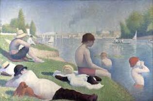
"Bathers at Asnières" Georges Seurat, 1884
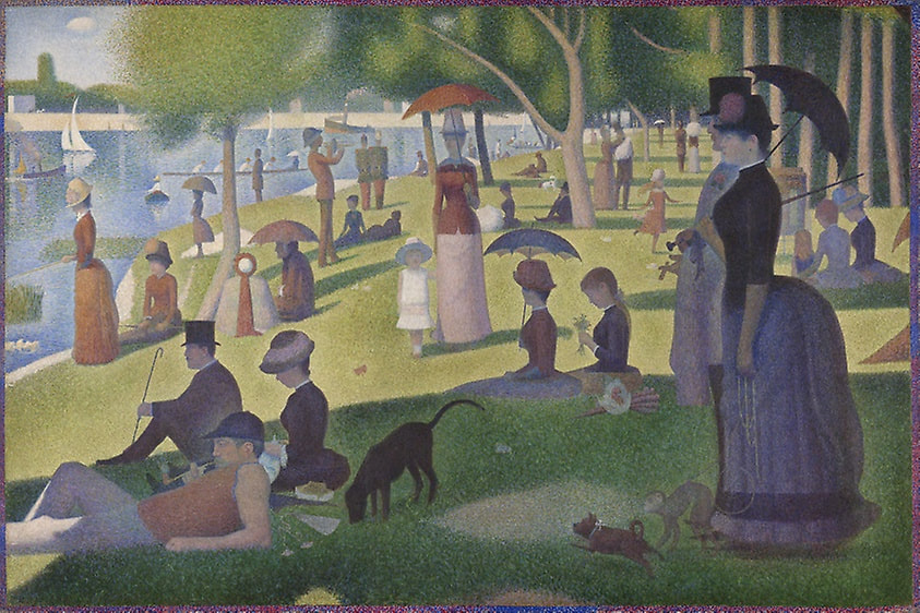
"A Sunday on La Grand Jatte" Georges Seurat, 1886
|
Georges Seurat was a French painter and pointillist. He used very precisely placed dots and color theory to make his colors more vibrant. He would place strokes of complimentary colors in other colors. For example, he placed tiny strokes of red in the grass. From a distance, it makes the grass appear brighter and fuller. For my piece I am using colored pencils, so it would be very hard to place single dots. Therefore, I want to use short strokes that merge the colors together. I like the relaxed colors in both pieces, and I want to incorporate colors like these in my own illustrations. Both the pieces are also landscapes, which is what I will most likely be doing. His pieces use many curved lines that give a feeling of relaxation and piece. The subjects in both pieces appear still and calm. I want one of my pieces to have this feeling by using organic shapes and curved lines. For the other, I will use geometric shapes and harsher lines to make the piece feel more stiff. |
|
Galileo was an Italian scientist and scholar. His discoveries laid the foundation for modern physics and astronomy. Although he was threatened by the church numerous times for speaking out against the norms, he constantly fought for his discoveries and was devoted to the scientific truth. I love space and the stars and admire his for standing up for what he believed. Space fascinates me, and so I thought it would be fun to put Galileo in space. It's a setting you would never expect him to be in, yet it's also fitting since it was something he loved. |
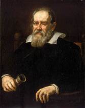
"Portrait of Galileo" Justus Sustermans
|
Sketches
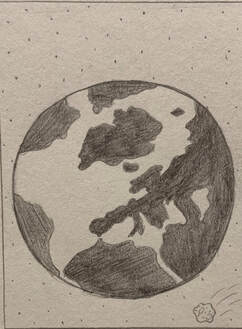
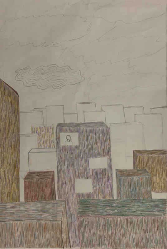
EarthI knew from the start of this project that I wanted to do something involving space, but I was unsure of what its opposite was. My first sketch was a plain view of Earth from space. I decided that this didn't really suit my "pollution" theme and that there isn't really anything special about this sketch. It's too unspecific and doesn't showcase anything special about Earth. It's a view of Earth from space, so it seems too similar to the space side. |
|
|
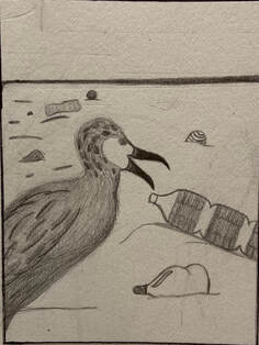
My second sketch was of a bird on a pollution-ridden beach. I felt that it really showed the pollution of our beaches and just how much humans have destroyed our planet's ecosystems. In the end, I wanted something different and decided to scrap this sketch. |
|
|
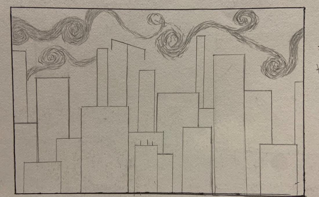
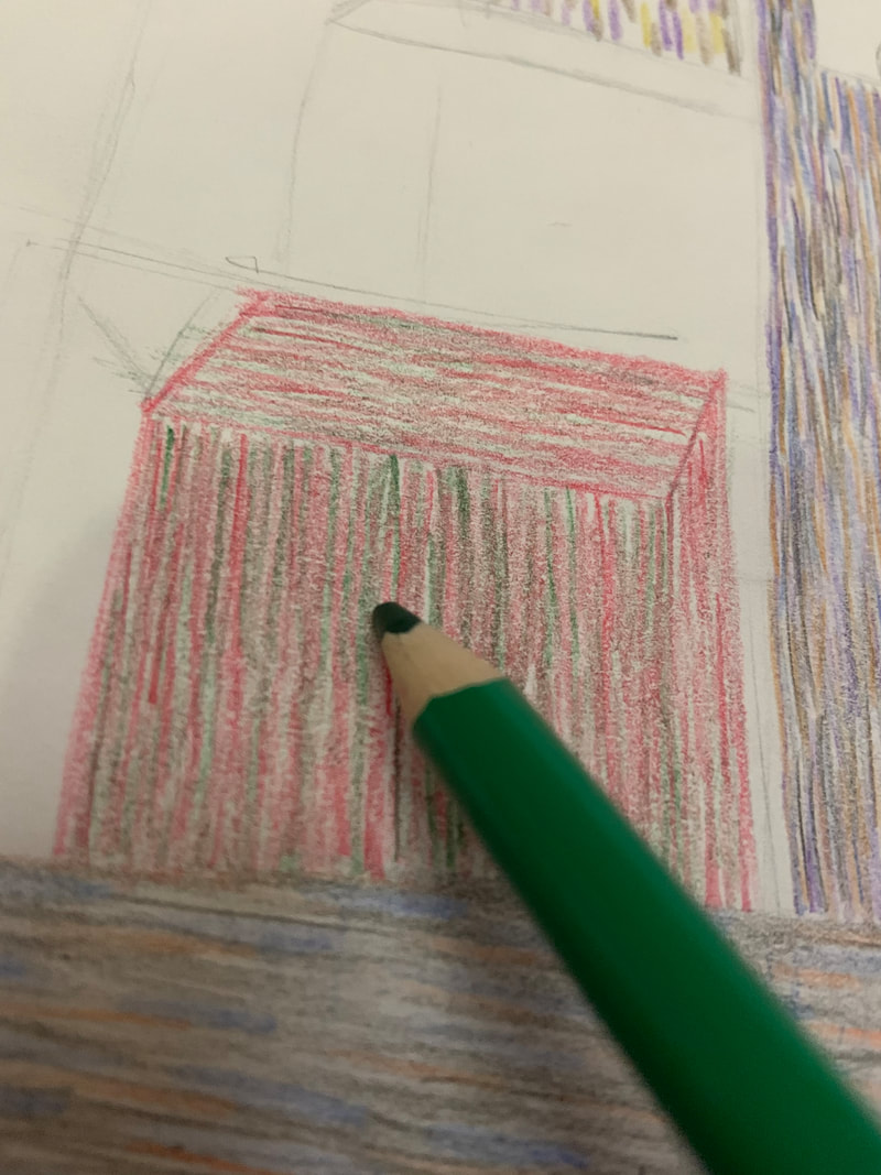
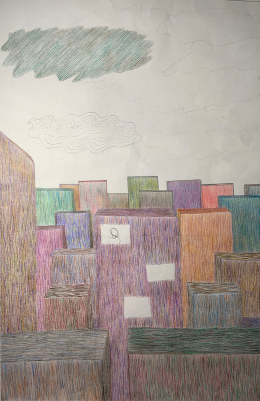
This sketch is most similar to my final product. Instead of showing pollution nature, I decided to show one of the dirtiest places: a city. I wanted the city to look almost like a landscape and demonstrate how packed the buildings are along with the pollution in the air. |
|
|
SpaceThis first sketch is a front-facing view of the spaceship. Galileo has his hands on the glass and is amazed at space and all the things he is seeing up close. I didn't really like the angle of it, so I decided to try other angles. |
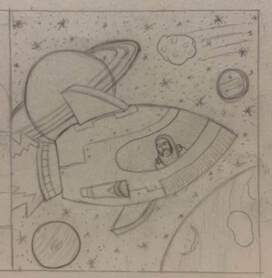
|
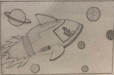
My second sketch is a side-view of the spaceship. I made the planets bigger to see what they would look like, but I felt like the piece looked to full. I want to give space a feeling of freshness and openness, so I felt like I should make the planets smaller and farther apart. |
|
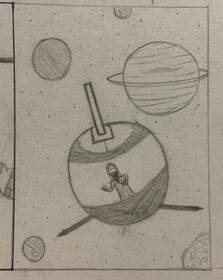
This is another side-view. This time I made the planets look farther away and more spaced out. This gives a feeling of space and openness, which is my idea of "clean" and "new." If you think about it, that is the opposite of pollution. Before we built skyscrapers and bridges, the Earth was much emptier and there was more space. Right now, that is what outer space is. We came and took away that space by building structures that ultimately destroy our environment. |
Experimentation
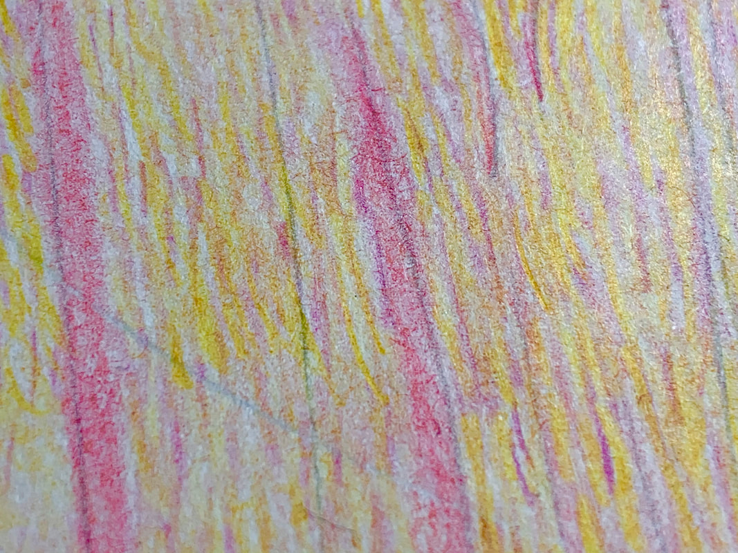
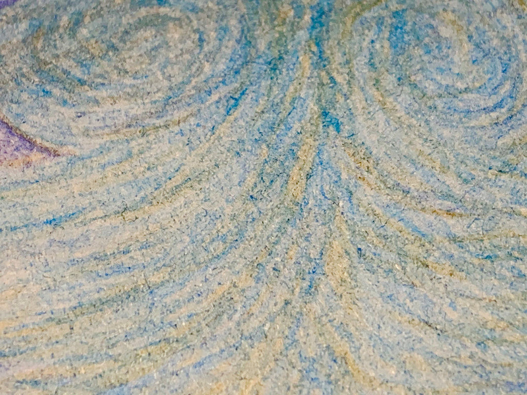
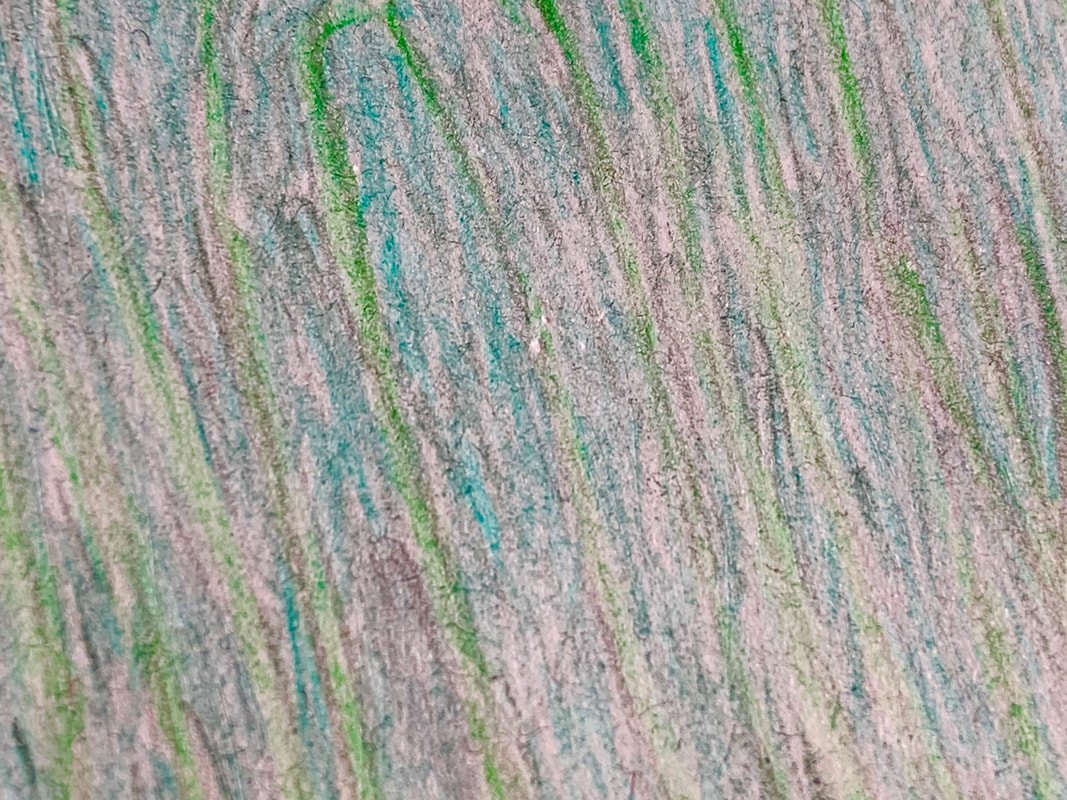
This was my first every time using color theory. I have never really tried to merge colors with tiny strokes, and I really liked the product. It made the colors richer and added a complexity that I enjoyed. I couldn't really do small points with colored pencils, so instead I put longer strokes of complimentary colors into each color. I know that I will eventually remake this piece with a different medium, perhaps then I can be more true to pointillism and put actual points into my piece.
Process
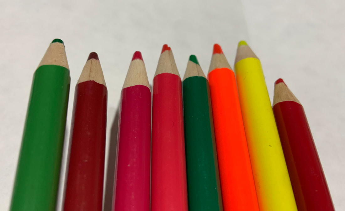
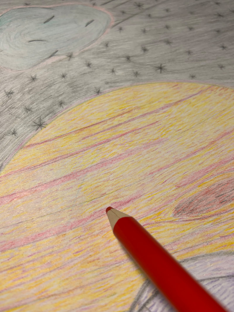
After doing my sketches, I copied my final ones onto big pieces of white paper. I knew that no graphite should be visible when I was finished, so I made sure that my pencil marks were very thin. I then put down base colors. I knew that I would need to put marks on top, so I made sure to not make the colors too dark. Finally, I put marks of complimentary colors and hues of the same color into each base color. For yellow I made purple marks, for red I placed green marks, and so on. At first, it was a bit difficult and the marks looked a bit robotic if I'm being honest. After a while, i started to get the hang of it and the marks started looking more natural.
|
After discovering that making small marks with colored pencils wasn't realistic, I tried long marks of different colored pencils. I used the concept of complimentary colors, putting red on green. In the beginning, I made the lines too short but I started to realize that longer marks closer to each other looked more pleasing. |
|
|
|
Reflection
After I had finished both pieces, I felt that the illustration with the ocean view didn't show the level of pollution I wanted to convey. I wanted to show a very polluted environment, so I thought it would be better suited to my theme to illustrate a cityscape of some kind. We met with Katie Martin-Meurer from UW-Milwaukee, and she agreed with that sentiment. She gave me an idea for how to compose the illustrations and I liked it a lot. I only met with her for 6 minutes, but her advice was very helpful. She advised me to make the city look very dark and dirty to contrast with the brighter colors and cleanliness of space. Because of this, I completely threw out my ocean view illustration. It didn't showcase my theme enough, so it was for the best. In the end, I wasn't satisfied with this project as much as the others. I didn't flesh out my ideas enough and that led to my final products feeling unfinished and not thoughtful enough. In the future I think I need to allow myself to brainstorm more and find more effective ways of doing this. The movement of the open space also felt strange to me. I want to include another movement or artist that would provide more movement to the piece. Perhaps Van Gogh because of the calmness of the swirls in many of his works.
|
"A Sunday on La Grand Jatte" Georges Seurat, 1886
"Bathers at Asnières" Georges Seurat, 1884
|
Compare & ContrastSimilarities:
Differences:
|


|
ACT Responses
Clearly explain how you are able to identify the cause-effect relationship between your inspiration and its effect upon your artwork.
It's clear in my work that I was inspired by the color theory and brush strokes used in Seurat's works. I also tried to replicate the peaceful feelings from the composition by using curved lines and lighter tones, which is something seen in many of his works.
What is the overall approach (POV) the author (from research) has regarding the topic of your inspiration?
The author has an informative and formal tone. They talk about Seurat's techniques, but not much about the meaning he wanted to put into his work.
What kind of generalizations and conclusions have you discovered about people, ideas, cultures, etc. while you researched your inspiration?
I concluded that there are many techniques to get to the same effects, such as using pointillism to get more vibrant colors. There's also nothing wrong with adding a personal twist to a piece when it suits the medium.
What was the central idea or theme around your inspirational research?
The central theme was contrasting the openness of space with the confined, closed feeling of earth.
What kind of inferences did you make while reading your research?
I inferred that Seurat was unappreciated in his time, as the official Salon rejected his art work. This shows me that sometimes artists have to fight the norms to add substance to new art and help it change and evolve.
Bibliography
Courthion, Pierre. “Georges Seurat.” Encyclopædia Britannica, Encyclopædia Britannica, Inc., 29 Aug. 2019,
https://www.britannica.com/biography/Georges-Seurat.
“Galileo.” Biography.com, A&E Networks Television, 4 Sept. 2019,
https://www.biography.com/scholar/galileo.
“Pointillism: Seurat’s Bathers at Asnières.” Pointillism: Seurat's Bathers at Asnières,
http://www.webexhibits.org/colorart/pointillism.html.
Seurat, Georges. “A Sunday on La Grande Jatte - 1884.” The Art Institute of Chicago, European Painting and Sculpture,
https://www.artic.edu/artworks/27992/a-sunday-on-la-grande-jatte-1884.
